Service Design
Design Research
The Healthy
Dick Project
How do we encourage younger, straight men to get STI testing regularly?

Four months
Independent capstone project
Illustrator, XD, Photoshop, InDesign, DSLR
Service design, interaction design, visual design, prototyping, service design, design research
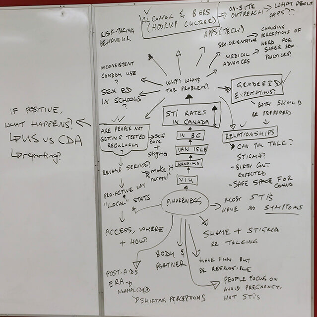
Based on sociological research, young heterosexual men in BC tend to avoid STI testing due to social, cultural, systemic, and gendered influences. They perceive STI testing to be optional, until a new relationship arises or after a risky encounter. They rely on female partners for contraceptives to prevent unplanned pregnancy, but aren’t as concerned about STIs. Systemically, the Canadian healthcare system doesn’t familiarize men to sexual health as it does with women. Hypermasculinity discourages men to ask for help. Many factors influence young men’s reluctance towards STI testing in BC, which contribute to increasing transmission rates.
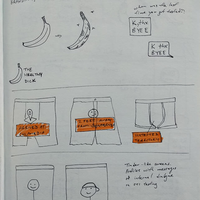
I wanted to merge phallic symbols and emoji culture into the branding of this campaign. This helps set a playful and cheeky tone to the project, which helps with approaching a taboo topic.



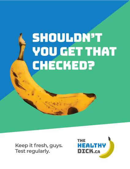
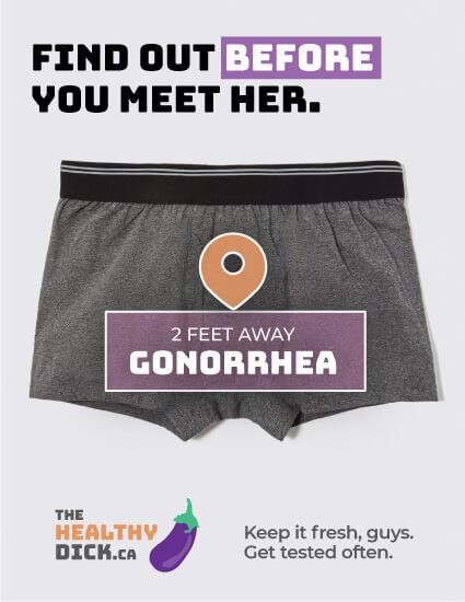
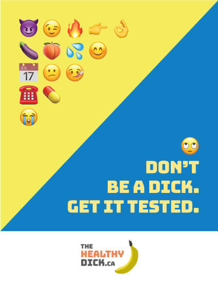
I created five poster comprehensives as a means to experiment with tone and visual aesthetics. Once the creative direction is confirmed, it will help dictate the rest of the project deliverables. Here are some examples of those poster concepts.
Popup STI Testing Tent
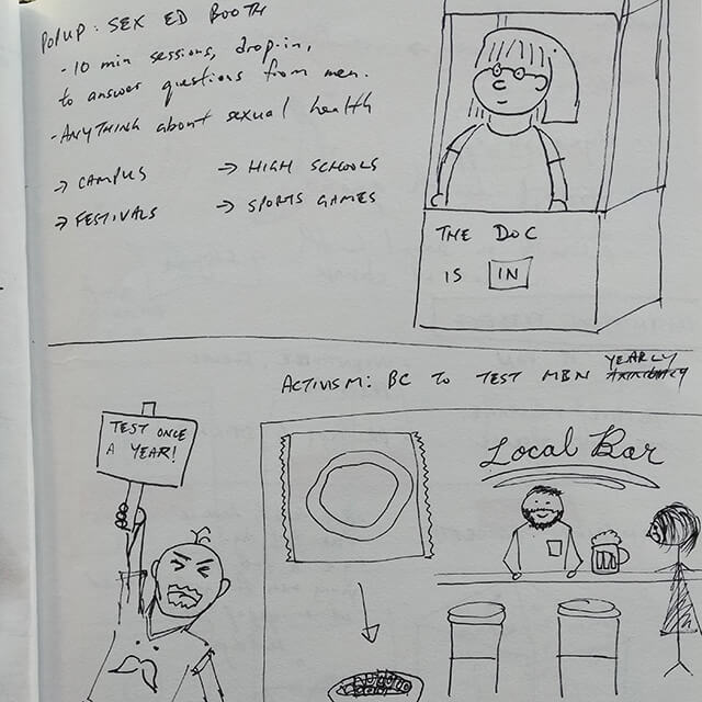
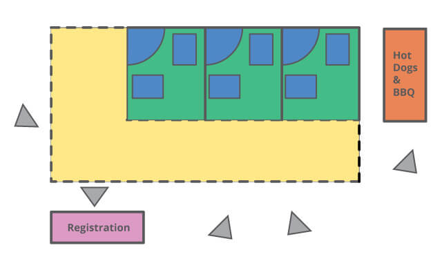
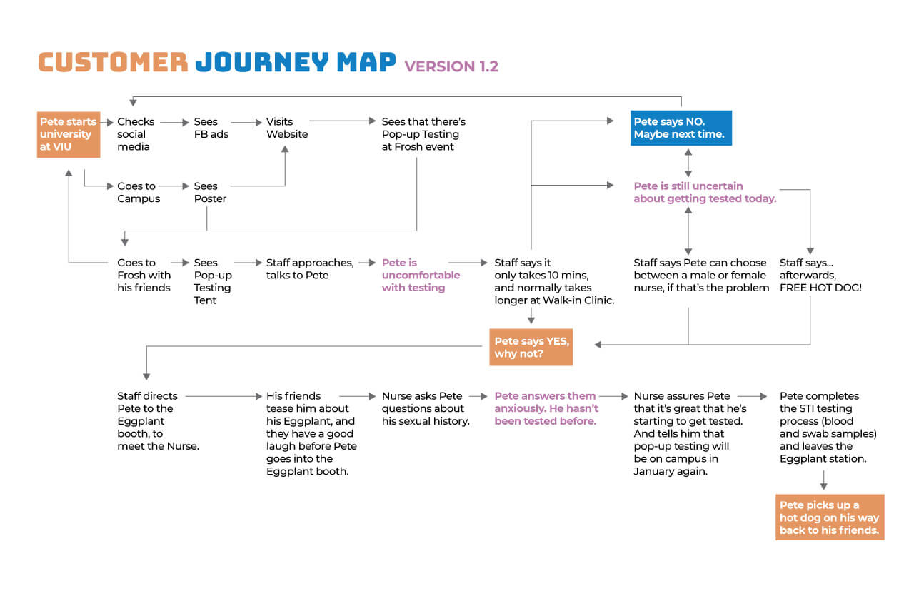
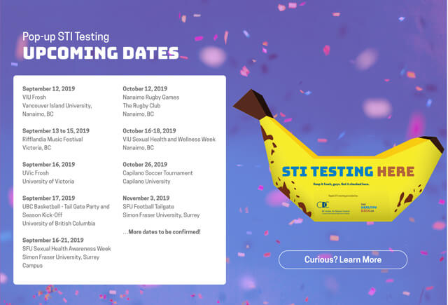
I wanted to see if it’s possible to take STI testing to where young men actually will be, instead of keeping it into the space of medical clinics. What if we could create a pop-up tent to bring this service to social situations or on campus?
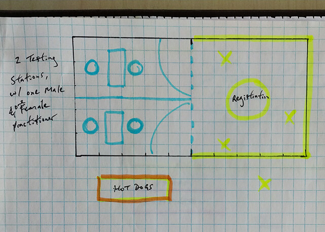

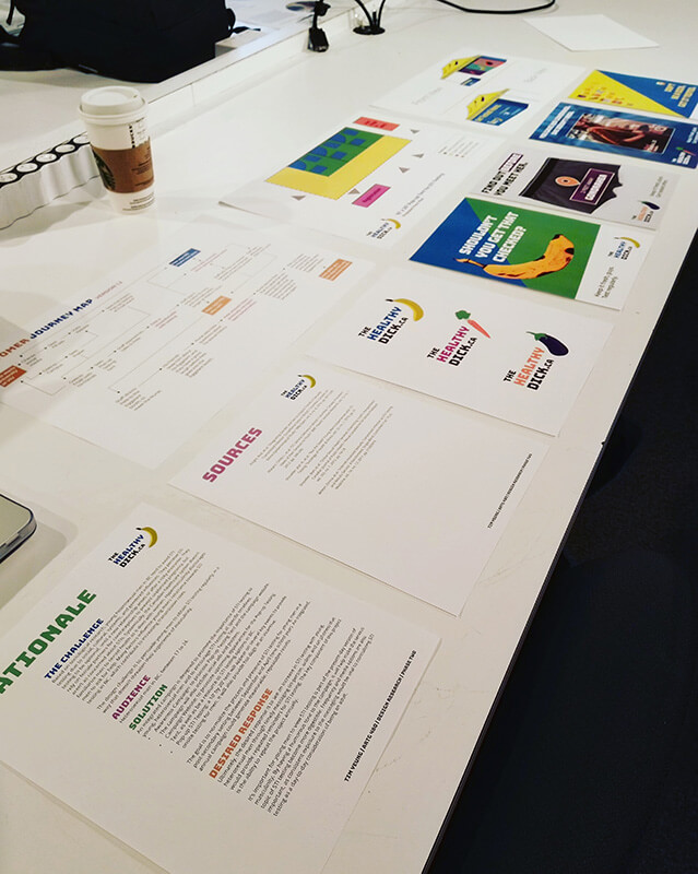
Met with six professional designers for feedback, over three hours.
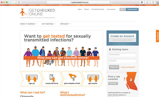
GetCheckedOnline.com currently exists as a pilot project. I tried several ways to obtain an account, and there are some limitations.
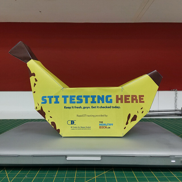
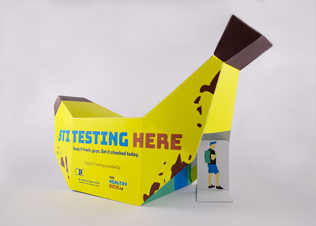
Using a banana-shaped tent to redefine interactions with STI testing.
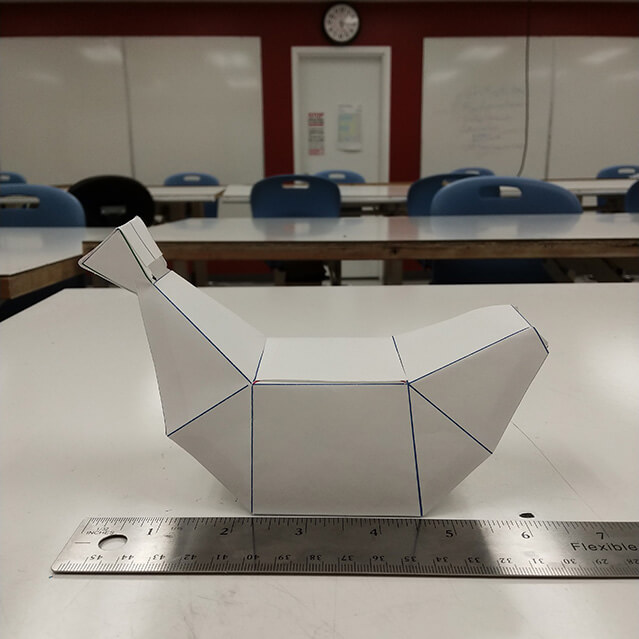
Instead of shying away from taking STI testing into a public space, I decided to double-down on the concept of bringing STI testing to young men directly. To do so, the pop-up testing tent needed to be more outrageous and captivating. I started to explore alternative shapes for the physical structure of the tent, inspired by the banana as a phallic symbol.
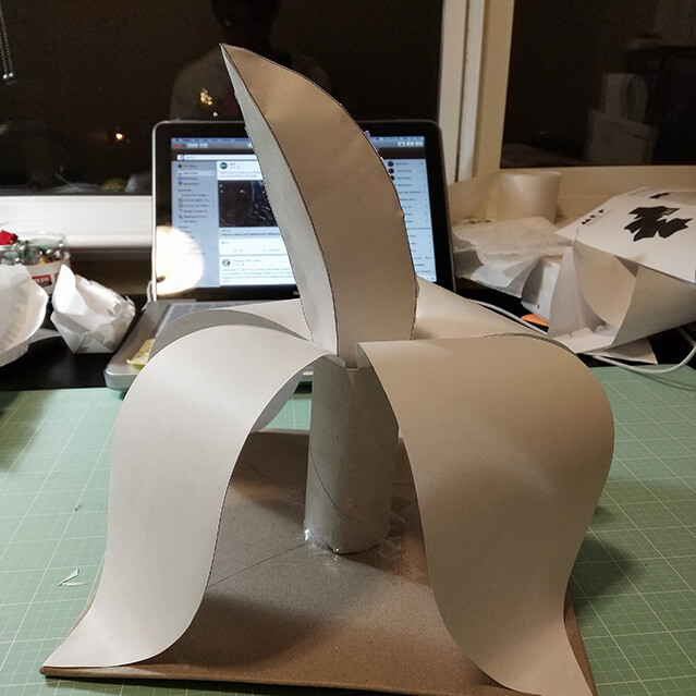
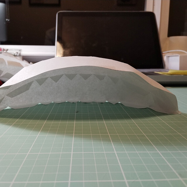
After a few days of shape explorations, I ended up pursuing a geometric shape for the pop-up tent. I brought visuals from the brand concept, and adjusted the design for the high-fideltity prototype.


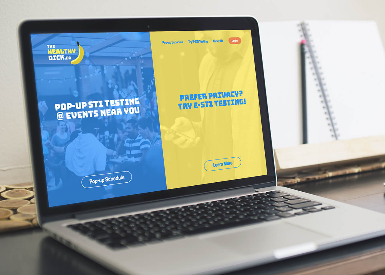
The website will promote upcoming pop-up testing dates, as well as be a means to offer e-STI testing. The website will also be a means to educate people about what e-STI testing is, since it’s still a fairly new concept in Canada. More importantly, it will also offer a more streamlined, easy-to-use e-STI testing portal.
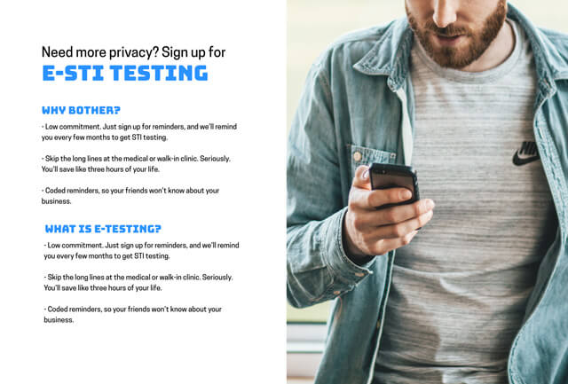
Due to feedback from critiques and informal feedback from users, stigma is still a huge issue when it comes to sexual health. The initial concept of having an app for e-STI testing will not work, due to concerns over privacy and visibility of the app on a smartphone.
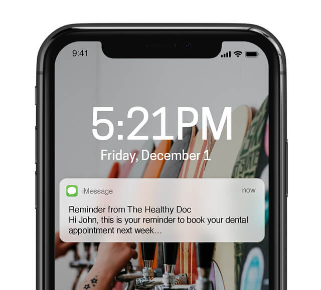
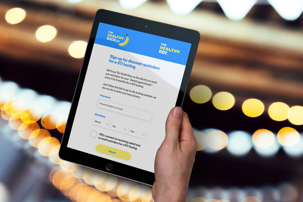
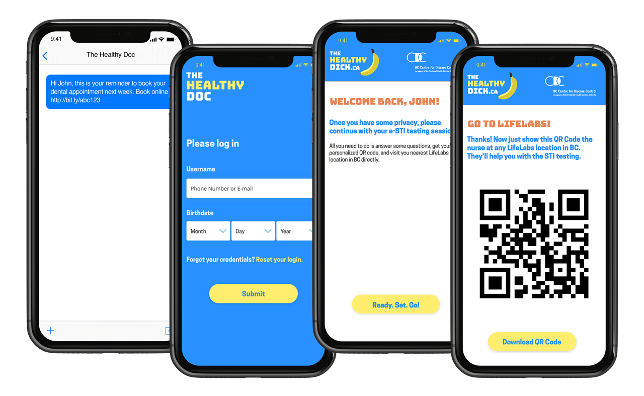
To address such concerns and to still provide a private option for STI testing, I’ve designed a discreet, texting-based option to send periodic reminders to young men about STI testing. The coded text leads users to “The Healthy Doc” (a decoy identity), which then directs users to the website app for e-STI testing when there is more privacy.
I met with four designers for a final panel critique.
There is one campaign identity. The related icons are used in various applications as secondary imagery, to reinforce the cheeky tone to the messaging.


Advertising and poster series would be placed in public areas where young men would frequent, such as coffee shops, bus stops, and urban areas.
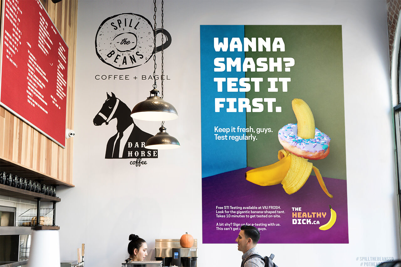
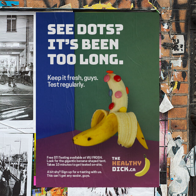
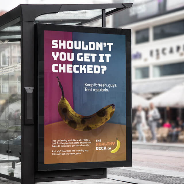
Similarly, the STI testing popup tent has to physically be where young men would socialize, in public events, such as frosh, music festivals, university sports games, and so on.

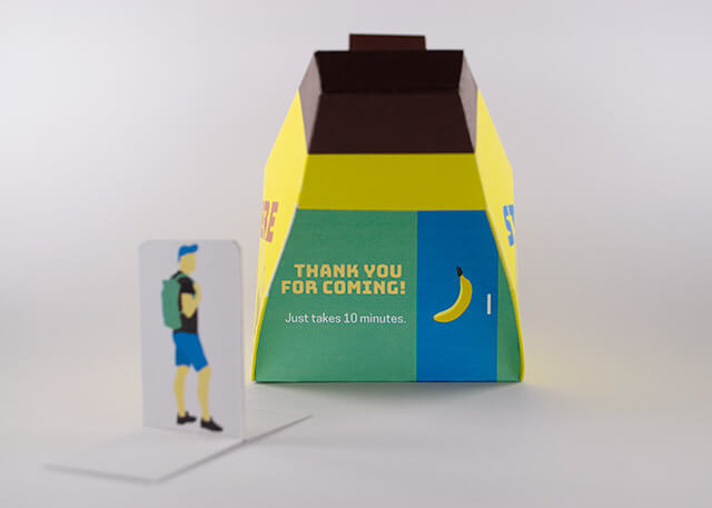
Discreet text reminders would help remind young men to obtain STI testing, and reach out in an alternative campaign identity, to maintain privacy. Due to stigma concerns, it is important to offer an alternative to onsite testing to young men.
The website will then serve three purposes:
