UX Design
Branding
Hello Chat App
How do we facilitate communication that transcends language barriers in increasingly diversified social groups?
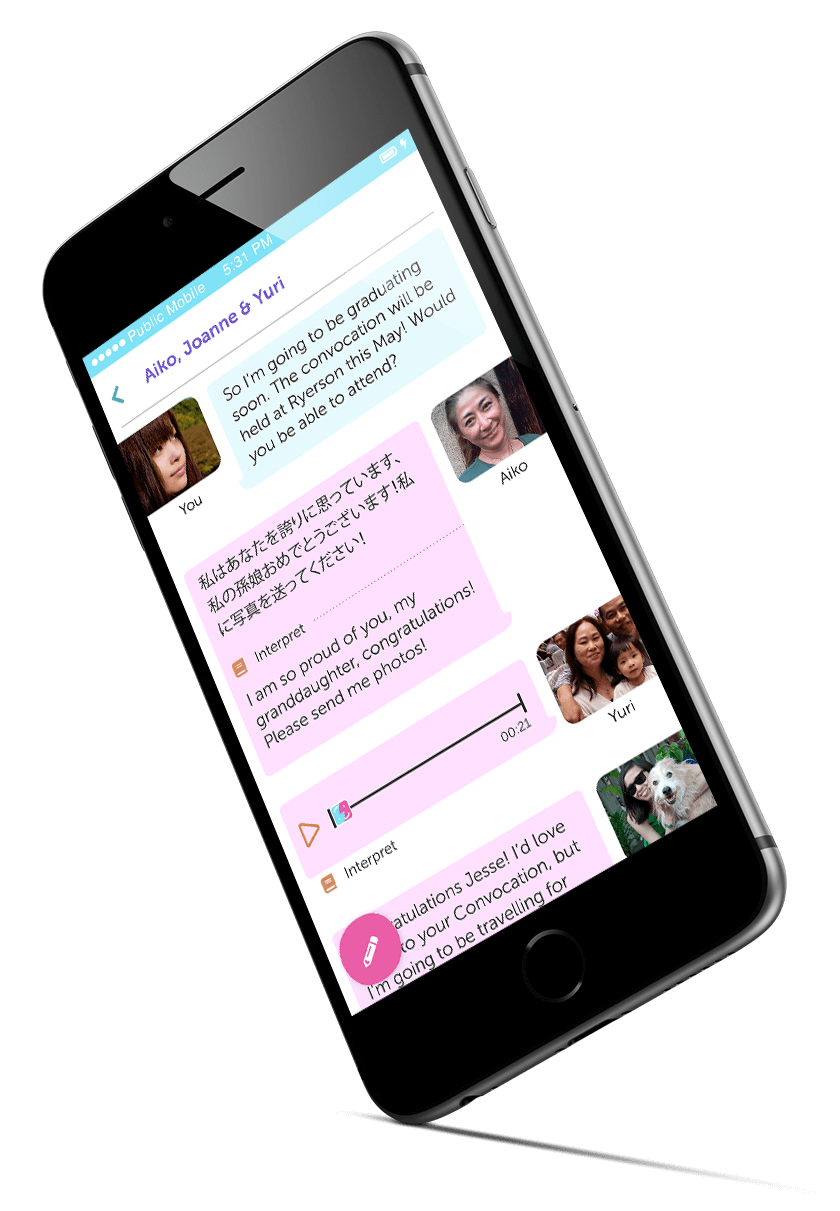
Five weeks
UX and branding designer
Illustrator, InVision
UX design, branding, prototyping, user testing, visual design
In North America, the number of multiracial people are increasingly. In particular, in Canada, the longer immigrant groups remain in Canada, the more likely they'll end up in bi-racial relationships, with multi-racial children. As Canadian families continue to diversify into multi-racial groups, the need for a communication tool that transcends language barriers becomes more important.
I created seven user personas to help guide this project. Below are two key personas that proved to be very useful during the project.
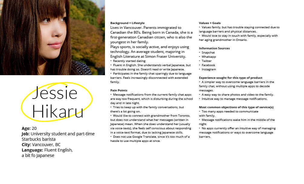
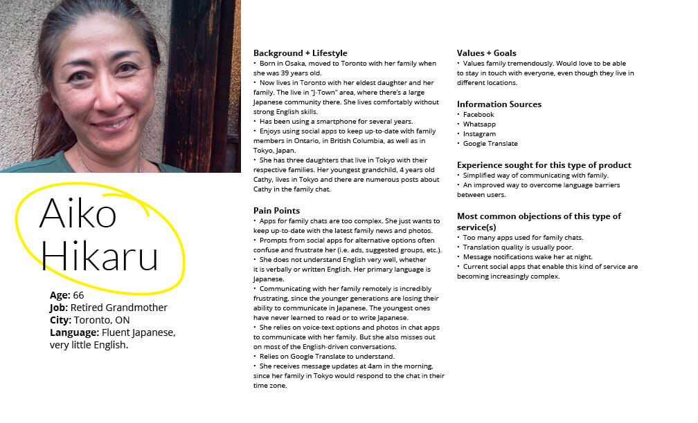
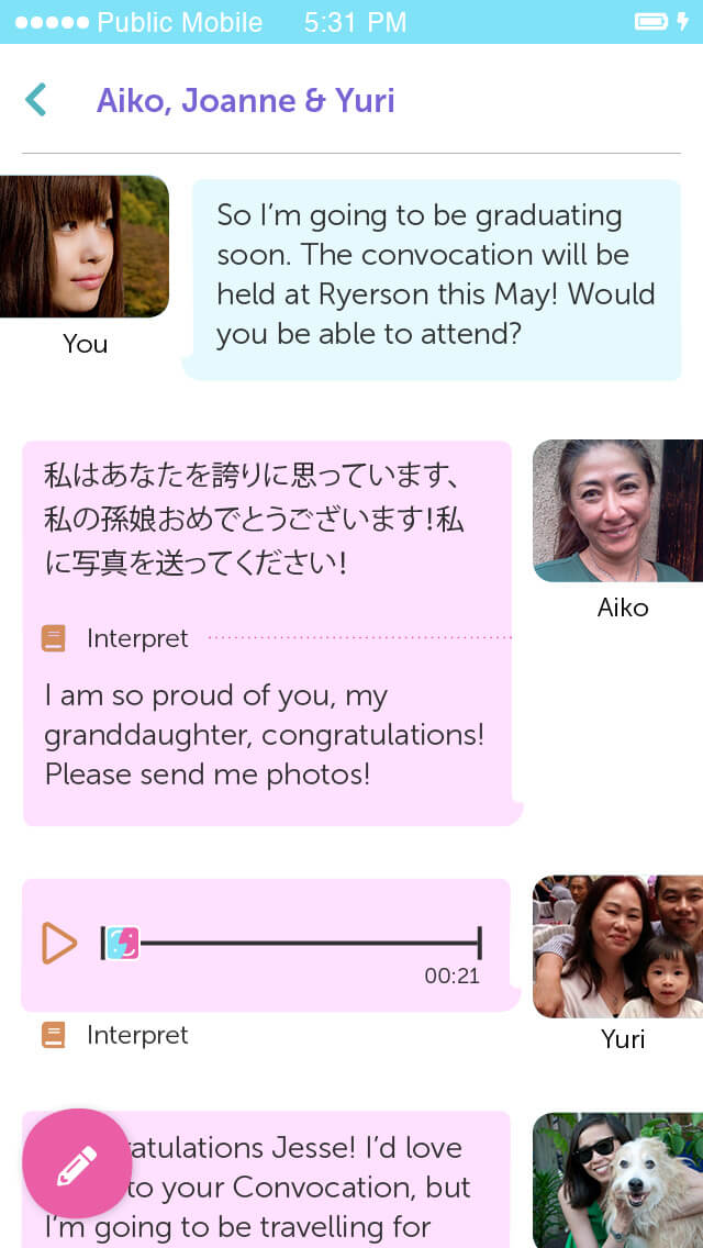
To help contextualize the app's functions, I built a narrative between the users. I found this approach helpful for this type of app, because it helped humanize the needs, desires, and wants of each persona based on their relationships. Here's an overview of how each persona relates to each other.
Jessie Hikaru
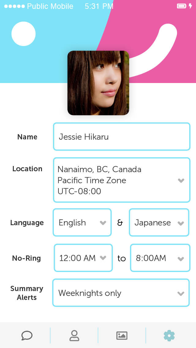
Jessie Hikaru is a university student who would like to stay in touch with her grandmother and friends, but does not understand Japanese very well.
Yuri Hikaru
Yuri Hikaru is Jessie's mother. She is fluent in English and Japanese and currently lives in Vancouver as a single mother. She tries to teach Aiko how to use multiple apps to communicate with Jessie (Whatsapp, Google Translate, etc.), but has a hard time passing on that ability to use current technology to her 66-year-old mother.
Aiko Hikaru
Aiko Hikaru is a retired grandmother who immigrated to Toronto in the 1980s. She lives in a Japanese-Canadian community in Toronto, and rarely needs to use her English skills now. She'd like to stay in touch with her granddaughter in Vancouver, but is often frustrated with the language barrier and chat apps.
Joanne Hikaru-Jones
Joanne Hikaru-Jones is Jessie's aunt. She is first-generation Japanese-Canadian, who is educated in Toronto. She worked in a tech company for six years, where she met her husband, James Jones. After getting married, the couple moved to Vancouver to continue their careers in tech, while balancing family needs with their young daughter.
James Jones
James Jones lives in Vancouver with Joanne. James is Francophone Canadian, who is fluent in French and English. He finds communicating with Joanne's family difficult due to language barriers. He wants to keep Joanne's family up-to-date with his daughter's latest news.
Keith Yamazaki
Keith is Aiko's cousin. He is currently studying management in Germany. He's excited to travel and to pursue his education abroad. At the same time, he often feels left out from the latest happenings from the family circle back in Canada. He speaks English only and has no understanding of Japanese.
I started with brainstorming features that would be helpful to people from multi-cultural families and social circles. In addition, I started to consider how branding would come into play.
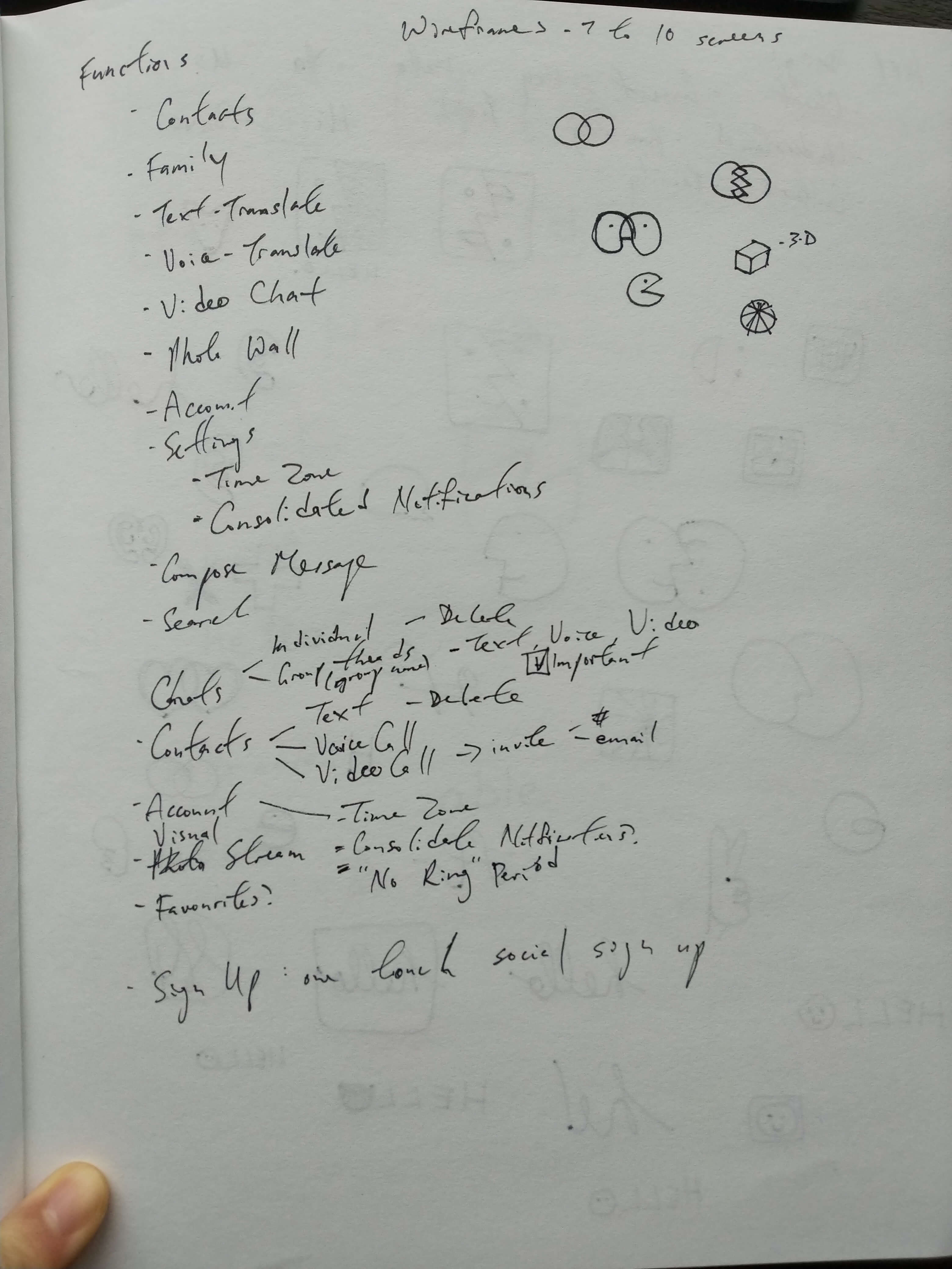
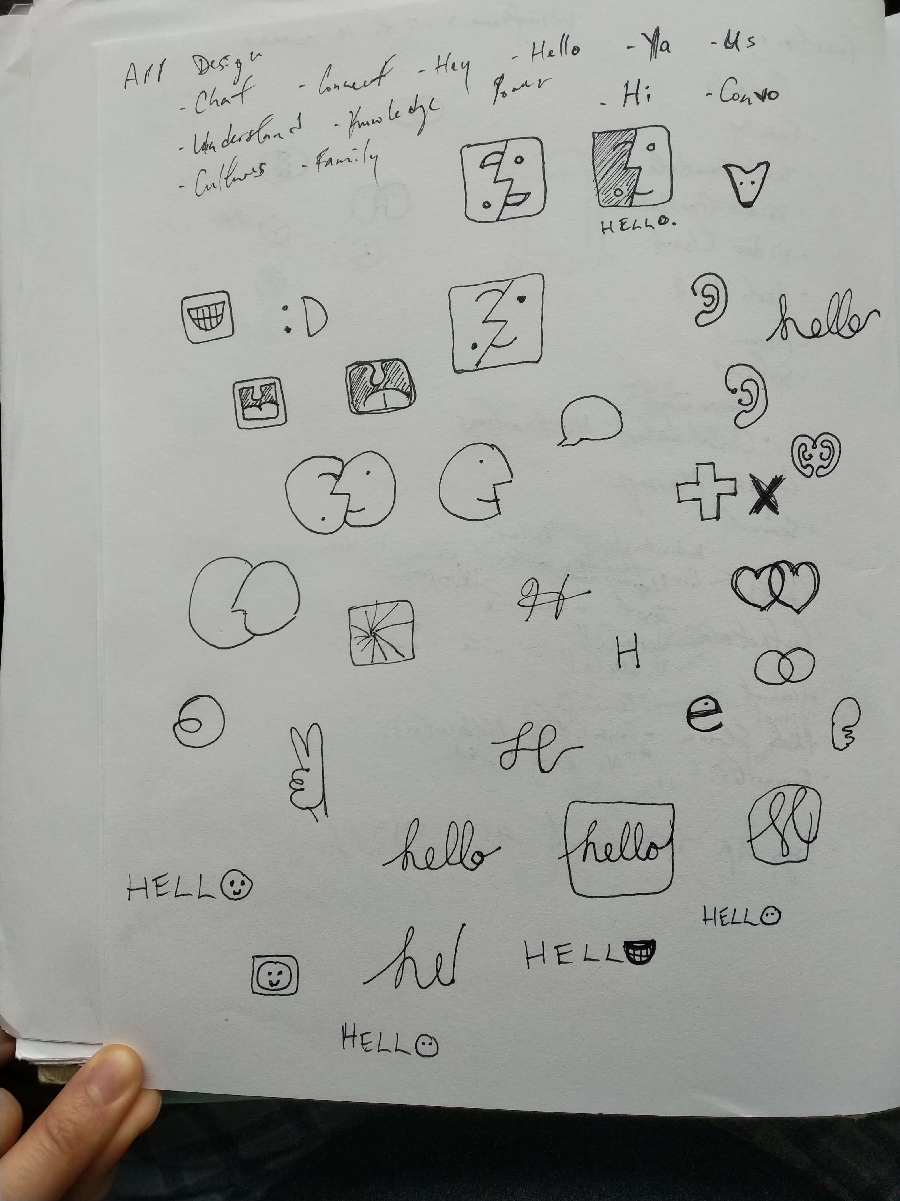
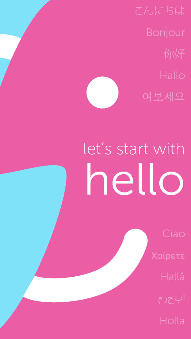
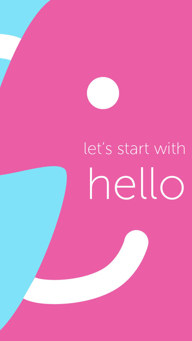
I wanted a symbol that represents the cyclical nature of communication. In a nearly yin-and-yang fashion, I created the following brand to solidify the cyclical nature of communication, where two points of view are intertwined with each other. The big picture is only complete when they're both present. I've used vibrant colours and minimal rounded shapes to create a friendly and energetic tone.
Accordingly, the creative direction carries out this vision to the rest of the UI treatment later on.
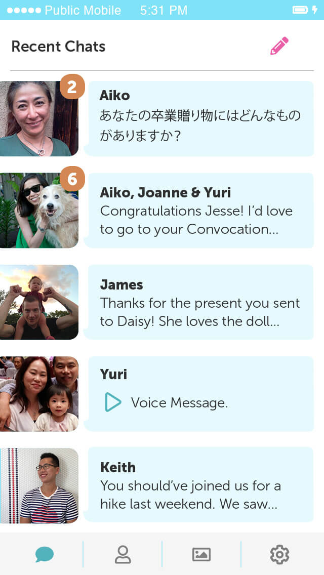
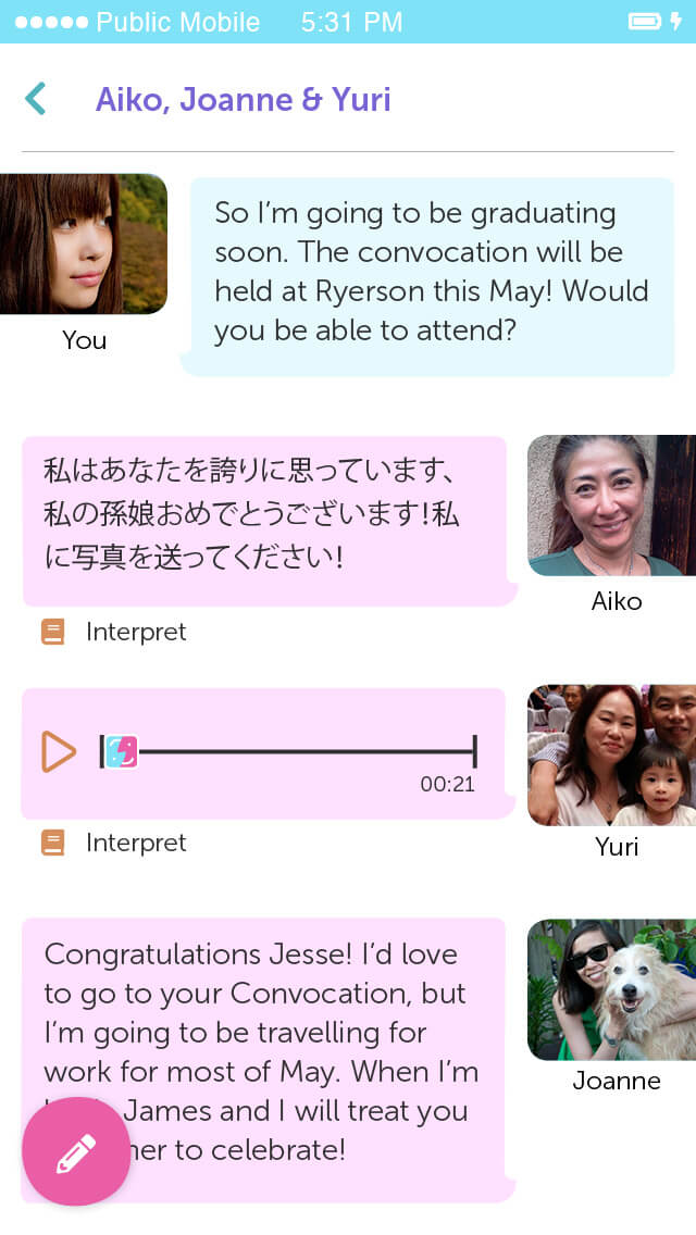
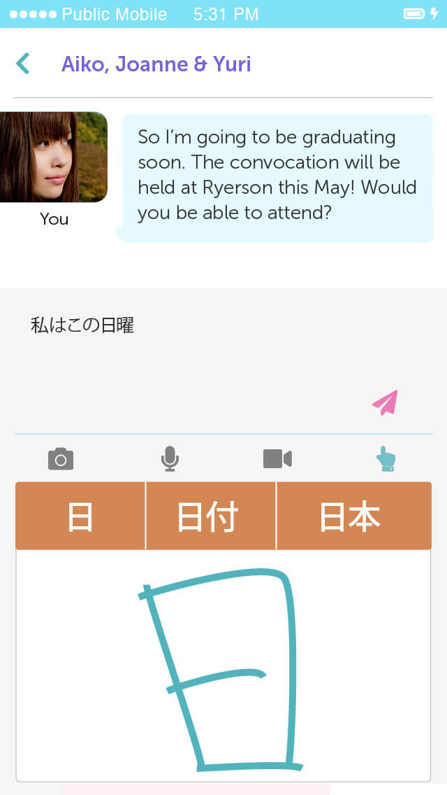
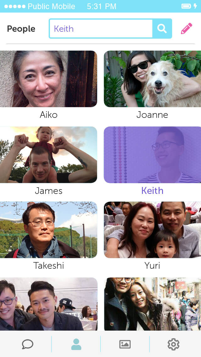
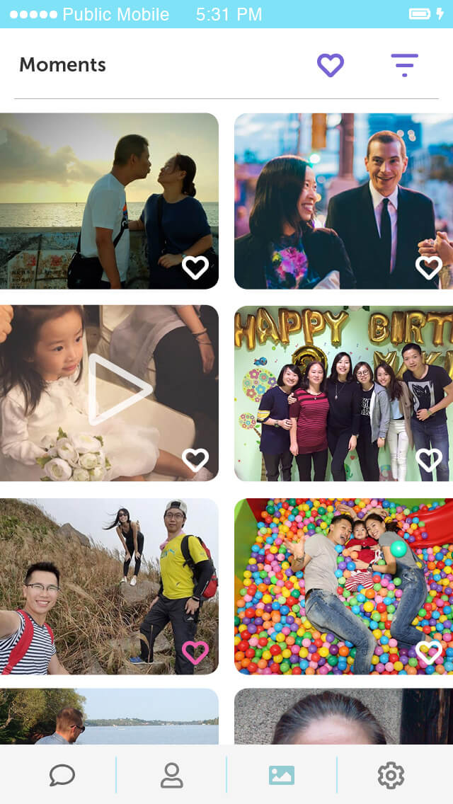
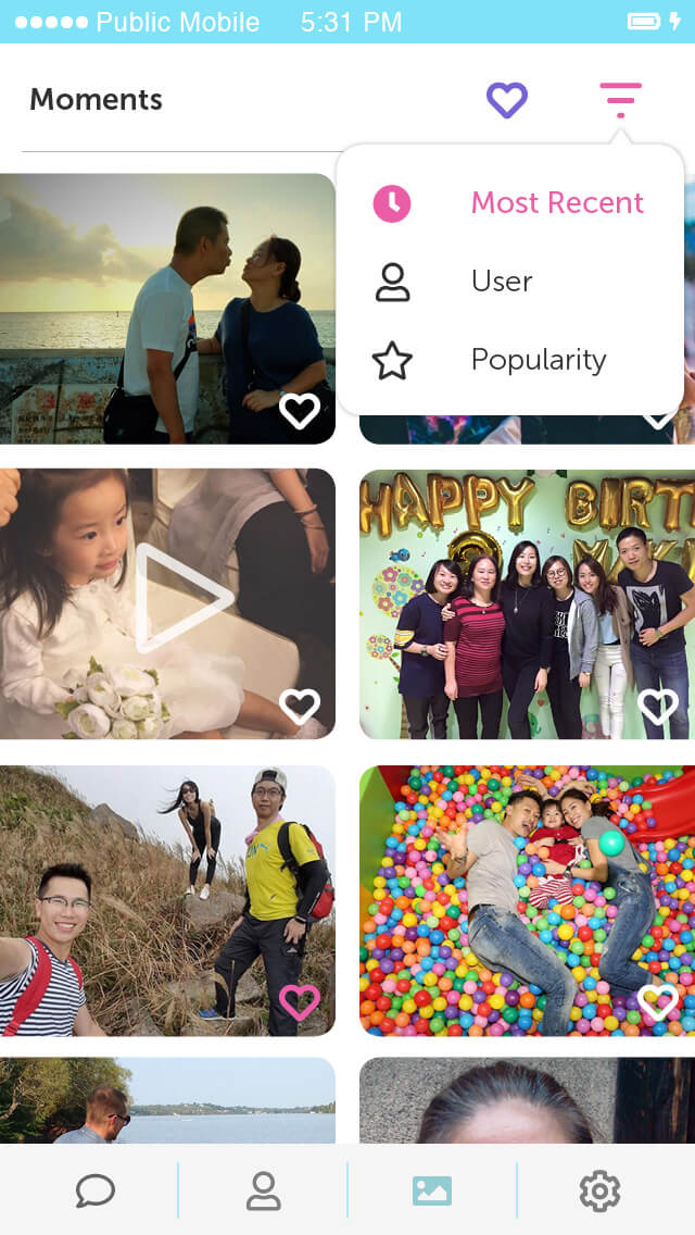
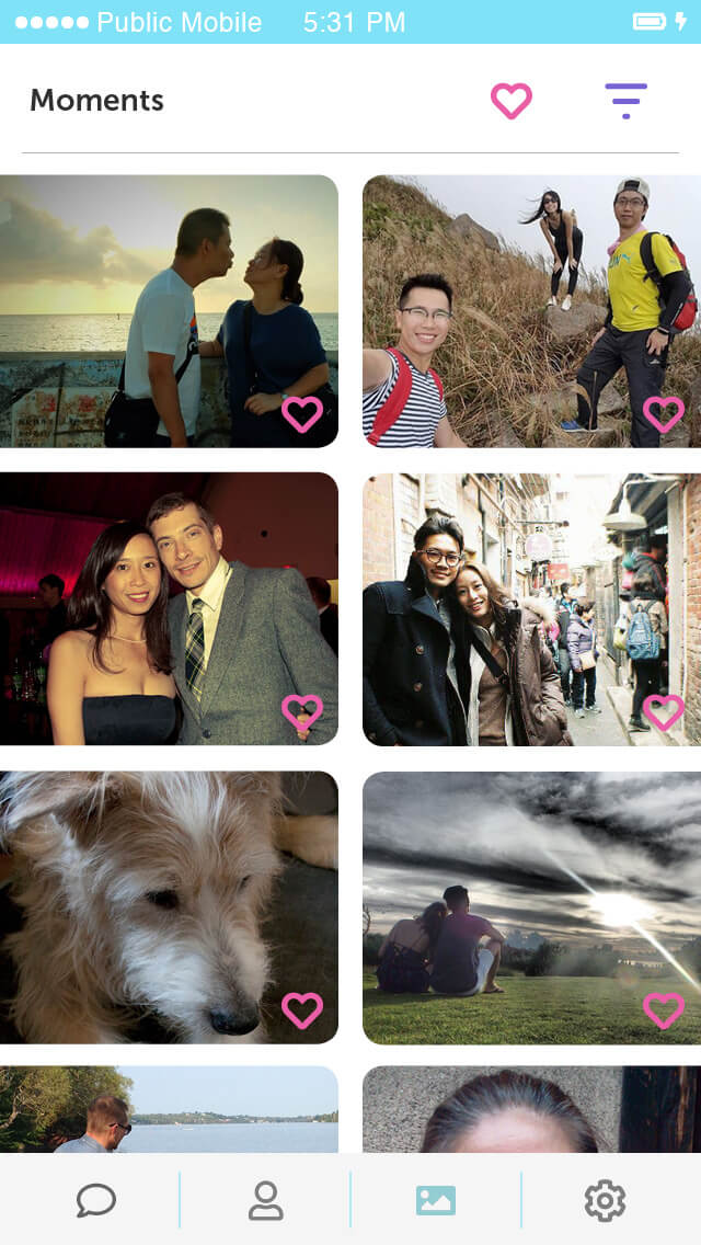
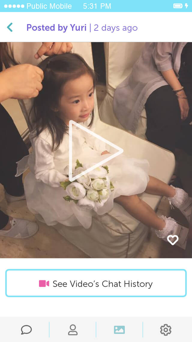
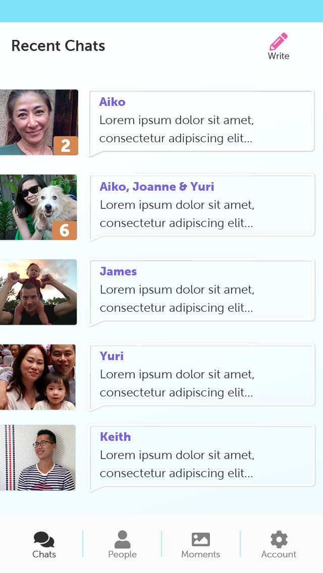
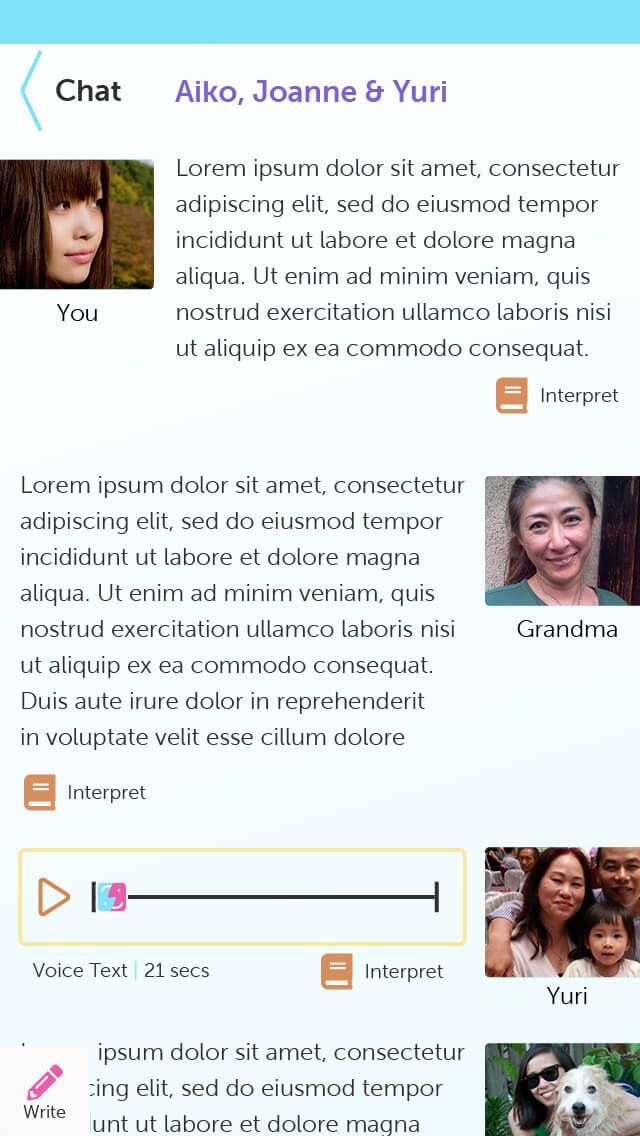
The wireframes begin with UX patterns that are common to many chat apps, but with augmented features to support multi-lingual users.

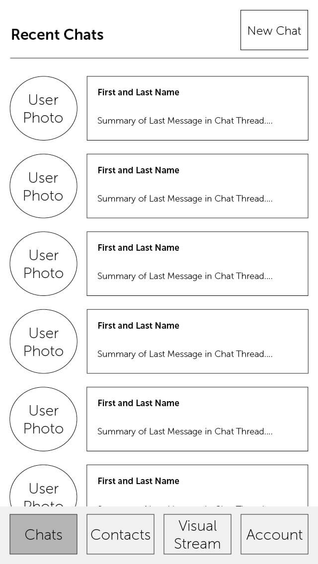
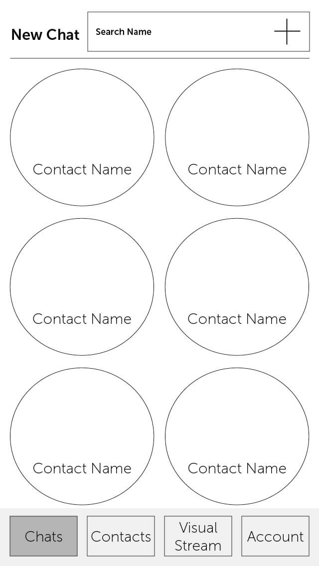
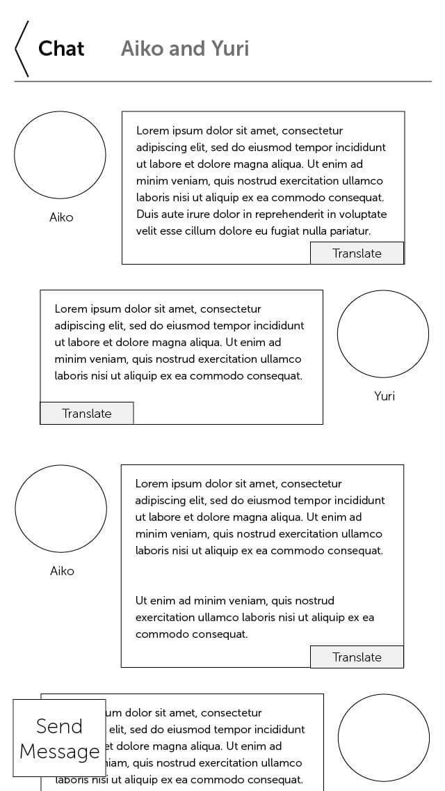
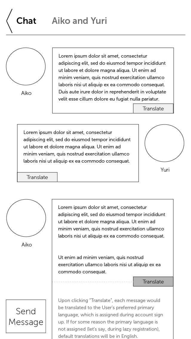
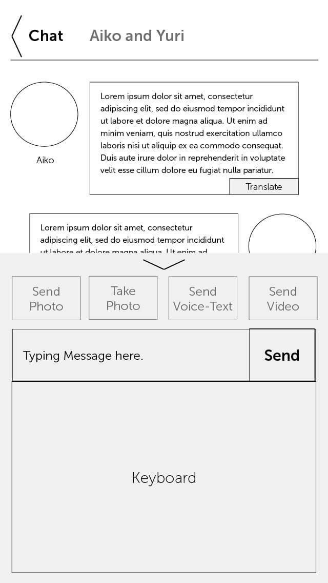
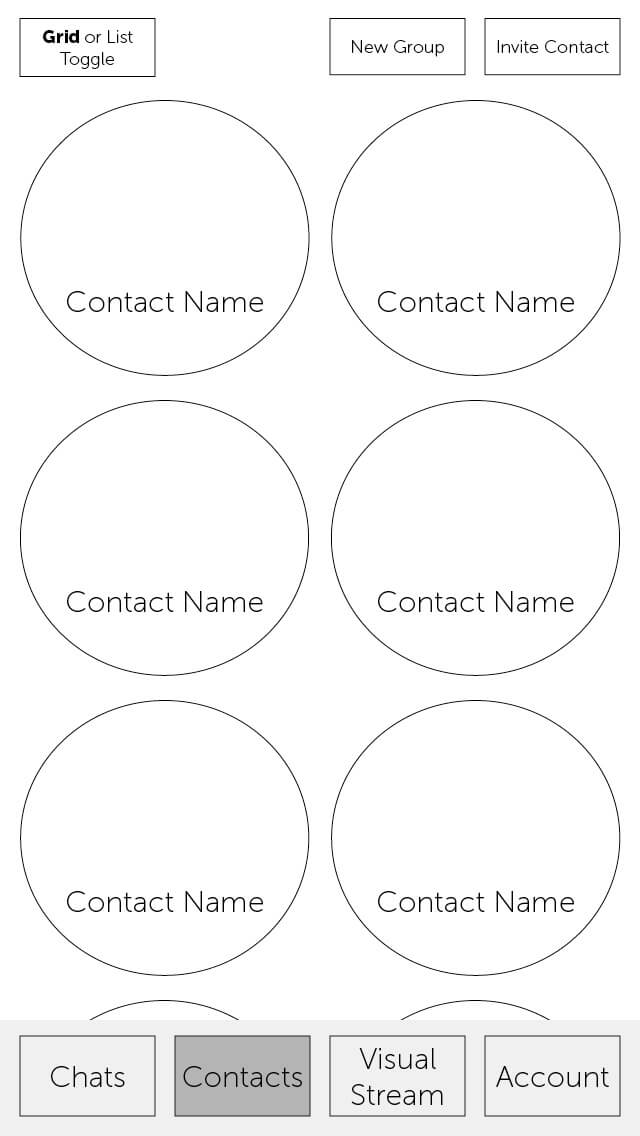
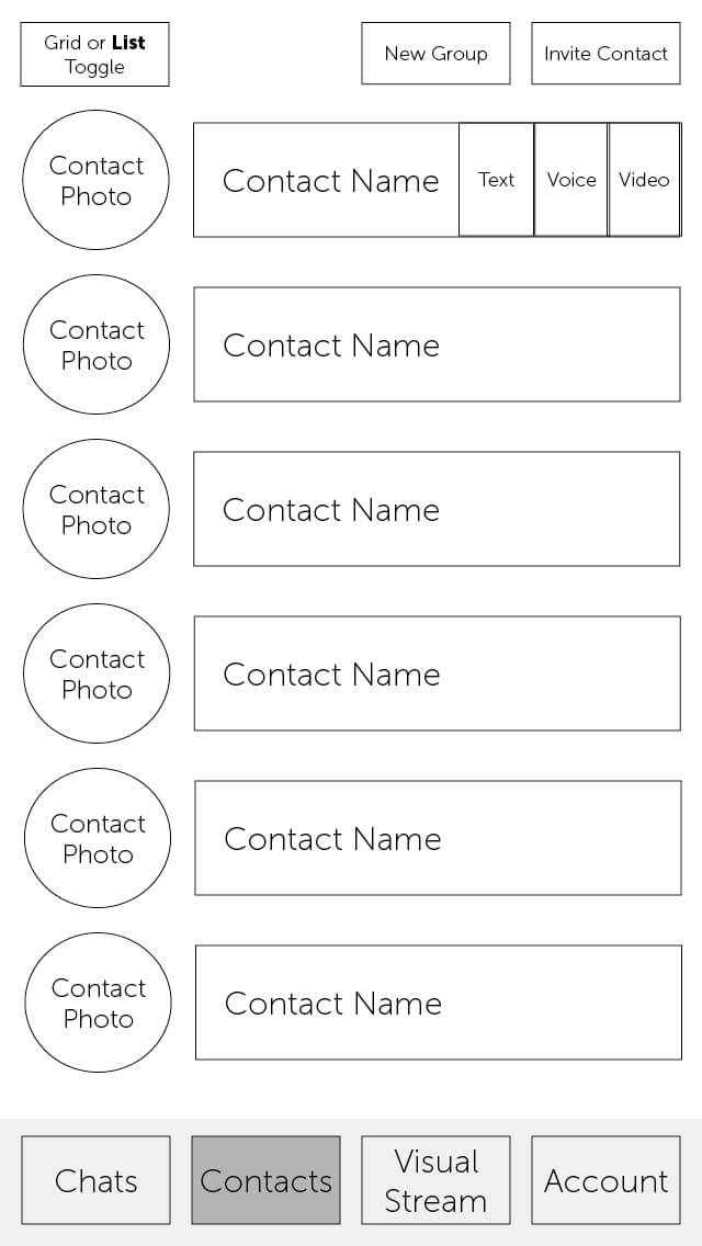
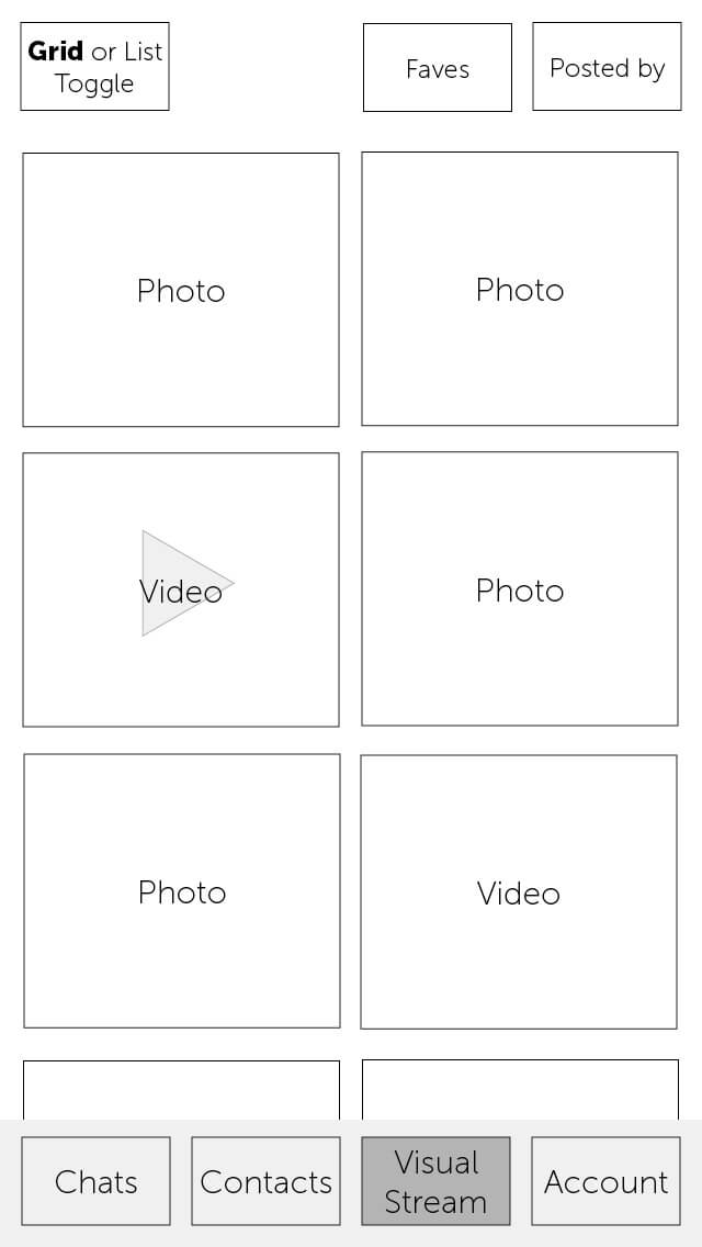
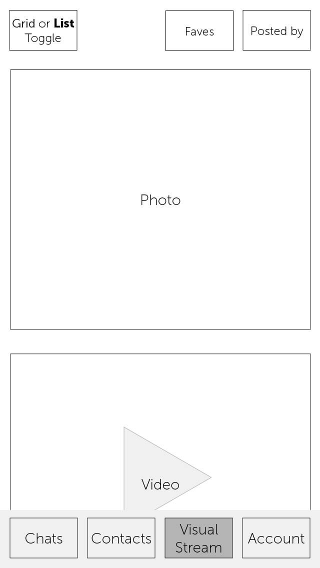
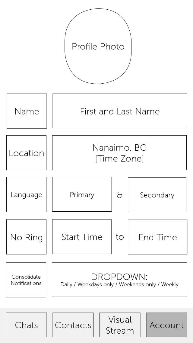
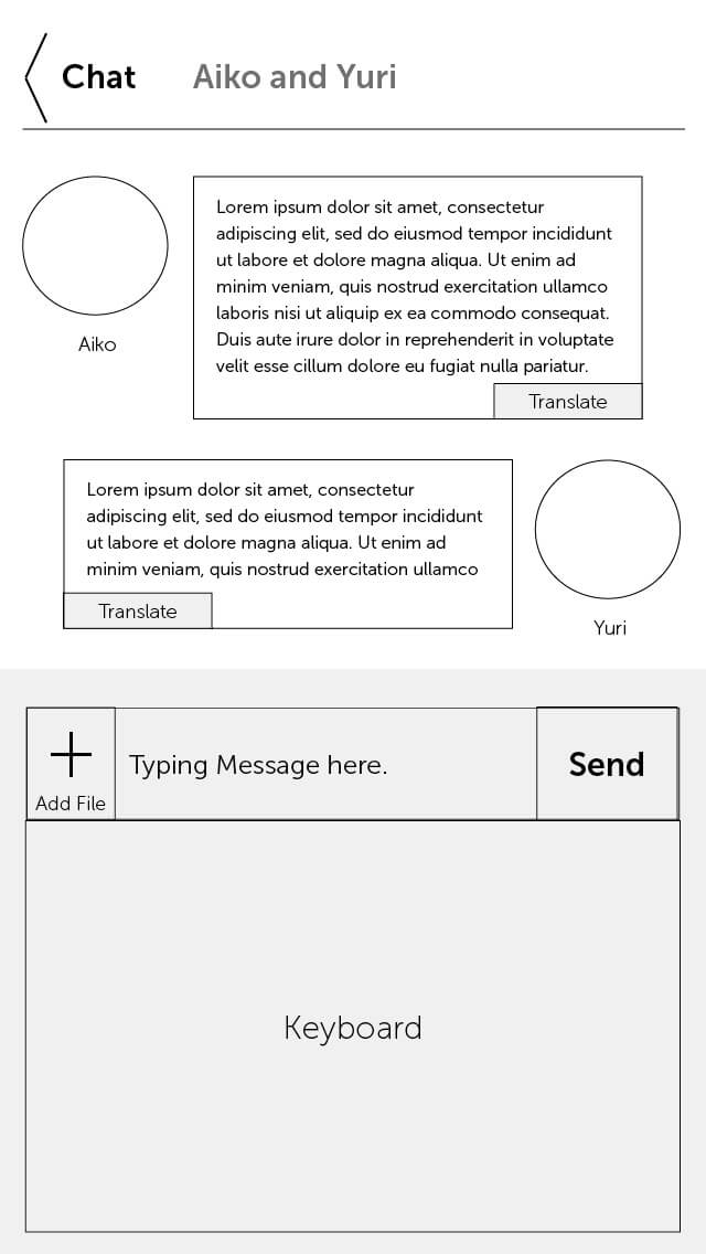
After creating the first lofi prototype, I tested the first version of the visual design with six users.
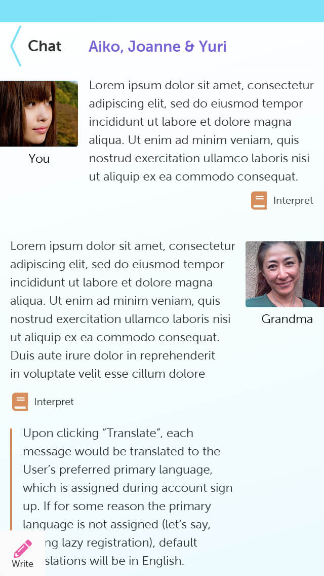
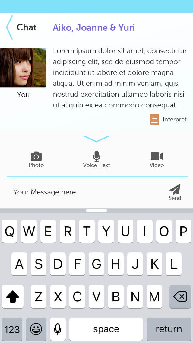
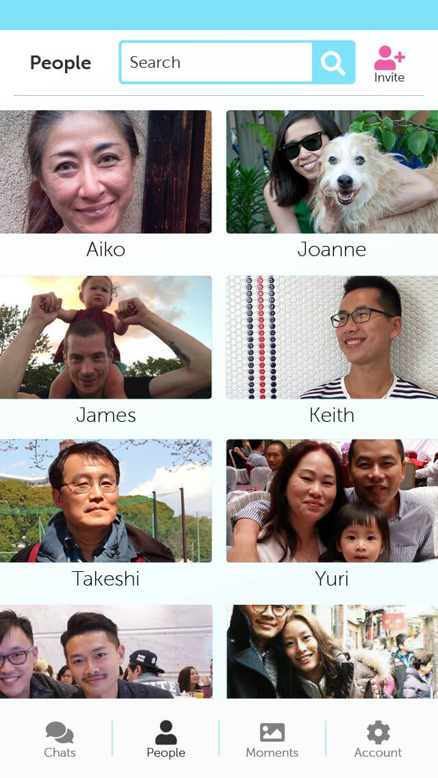
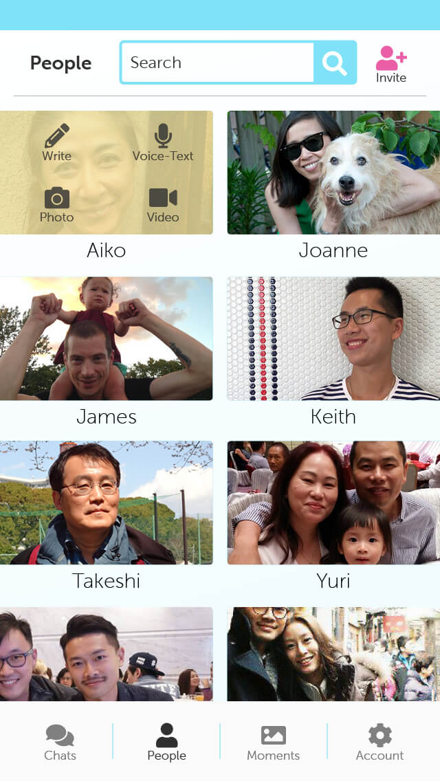

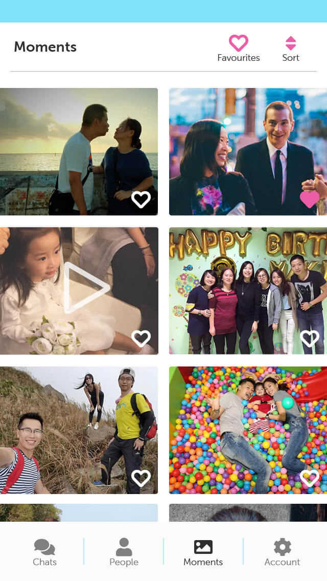
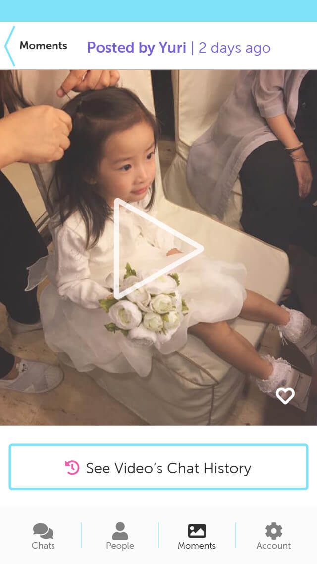
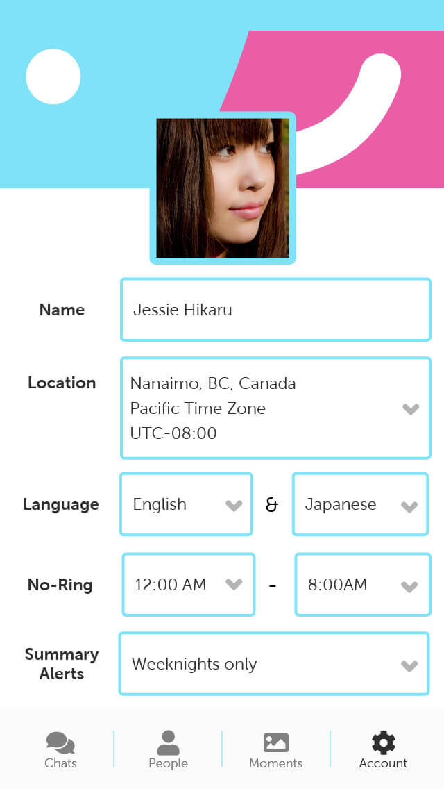
In total, I executed two rounds user testing, with six users per testing session.
After two rounds of testing and iterations, I finalized the prototype.
