UX Design
Human-Centered Design
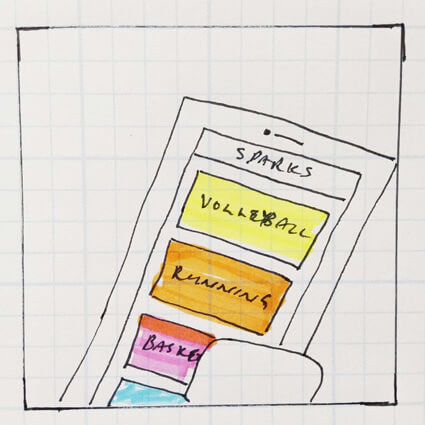
Pulse Fitness App
How do we provide structure for non-athletes to pursue recreational fitness?
Four months
Team 4 UX-UI Designers
XD, Trello, Illustrator, Google Docs / Drive / Slides
UX design, UI design, design facilitation, project management, user interviews, prototyping, user scenarios, app design
Upon project commencement, we identified the projects goal and objectives.
To develop an app that motivates users to participate in active lifestyles by providing structure and community for people seeking social exercise.
Based on healthcare research, young adults experience a drastic decrease in fitness levels, once they have graduated from post-secondary education. The key issue is that there are very few established social structures to encourage young adults to pursue recreational fitness, outside of physical education and varsity leagues from school.
We spoke with 10 potential users for initial research. They were men and women, between 18 to 35, who were busy individuals (full-time workers, students, etc.). Some were married, some were single. Some had young families. They had a diverse range of interests for fitness activities, ranging from running to basketball. We identified the needs, wants, and desires into some key themes.
We created six user personas to help guide this project. The three personas we've used the most often are Miriam, Maren, and Marcus. Below are some key highlights:
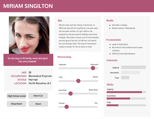

Miriam

Maren

Marcus
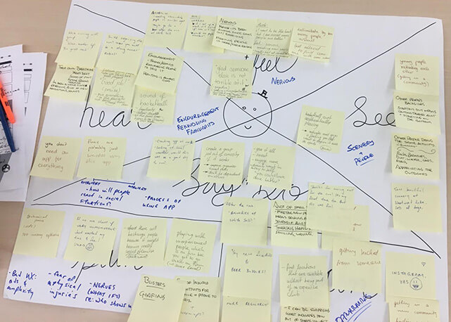
Equipped with these personas, we used an empathy map to generate ideas to gain further insights on potential users’ needs, wants, and desires that should be addressed.
We narrowed our user definition to exclude people over 30 years old, who begin to have rather different needs for fitness. Similarly, we found that we cannot cater to people with zero fitness experience, as there needs to be a general level of interest in fitness for this app to speak to such users.
As such, the revised user definition is: young adults (18-30) who were previously or are currently active, and are looking for a new way to meet like-minded participants without relying on organized sports teams.
We determined that there’s seven user tasks that we should generate user scenarios for:
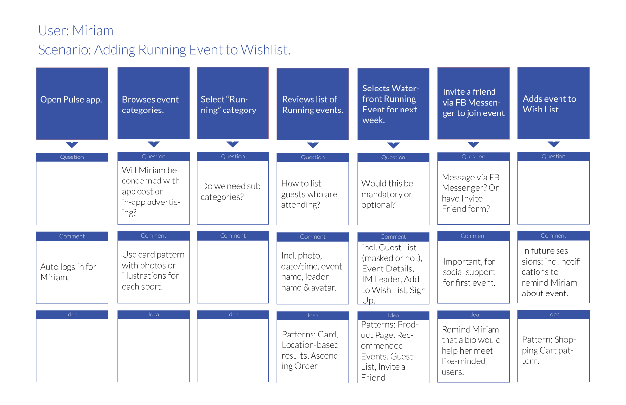
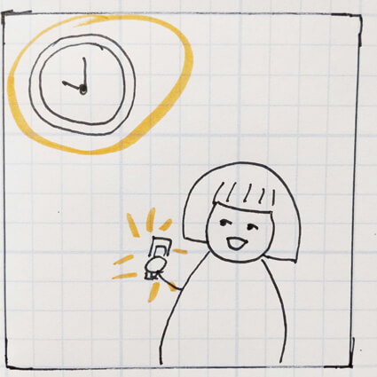
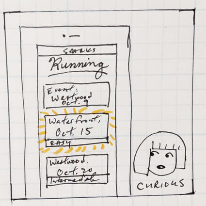
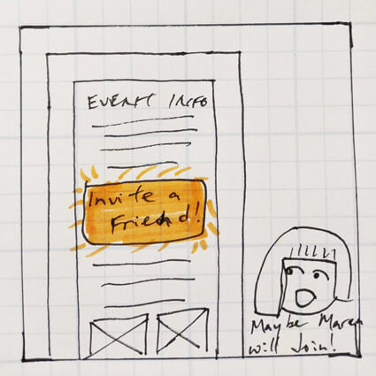
To humanize the information, we storyboarded some of the key user scenarios, in order to gain insights on user behaviour and pain points while interacting with this app concept. Below is a sample of this process for our persona, Miriam, a young professional and mother who is exploring new ways to integrate fitness to destress.

Having four designers from different disciplines and backgrounds work in a democratized setting was slowing down progress.
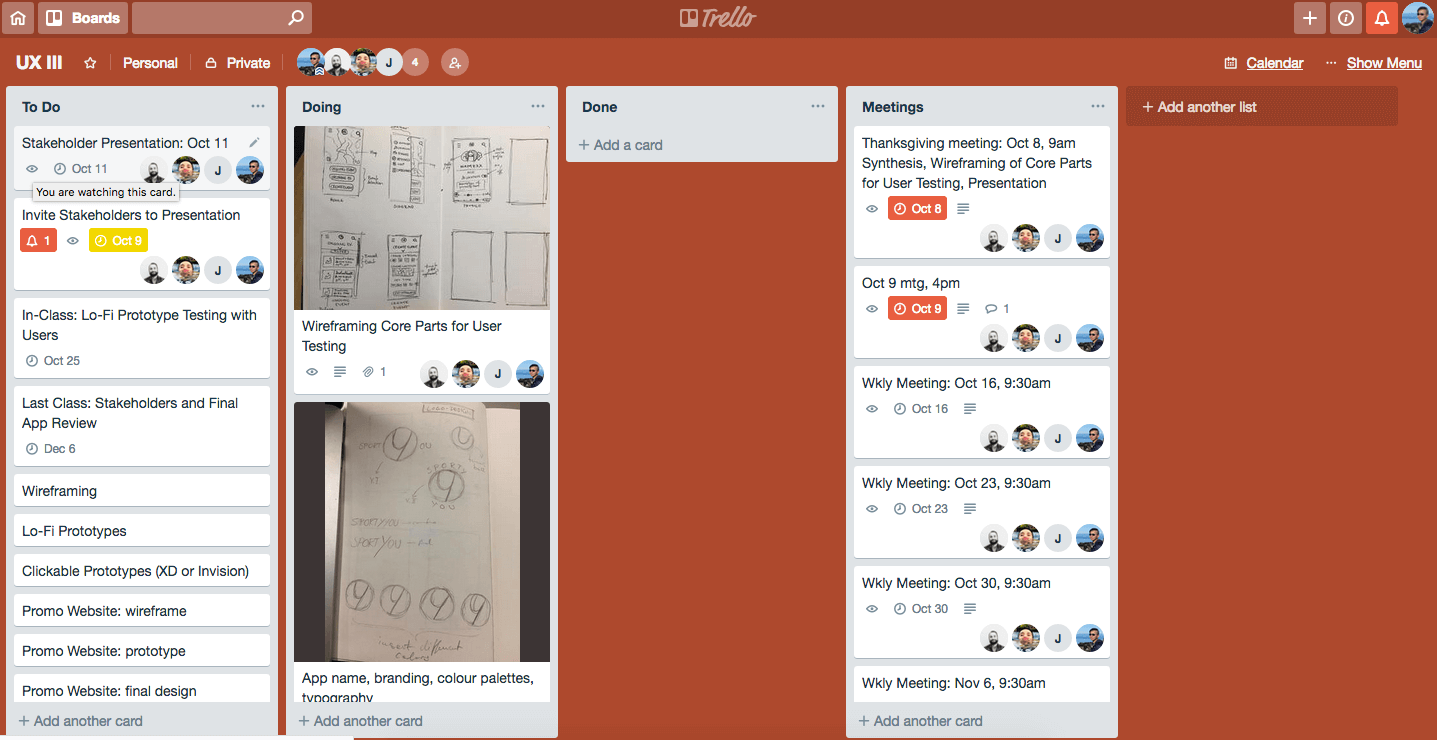
At this point, we needed structure. Since I was the team member who had more experience with project management, UX process, and human-centred design methods, I took a role of being an informal project lead, in terms of delegating tasks, distilling research into actionable tasks, delegating tasks, ensuring timelines were met, and using human-centred design methods to break through roadblocks. As part of taking the lead, I introduced the Trello board to the group to help manage task coordination.
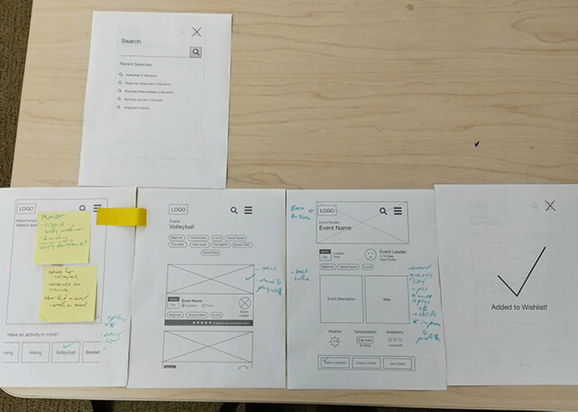
We spent some time ideating wireframes, based on the user scenarios that we’ve created. We had spent a significant amount of time in user research, and it was time to create potential solutions and to see how our different ideas may come together. We also had different ideas on what constitutes as a wireframe as opposed to a mockup or prototype, since the team was a multi-disciplinary team and not everyone was well-versed with UX terminology.
More importantly, all four of us came up with drastically different wireframes, featuring different user flows and patterns. Below are samples of wireframe screens from each of us:
I led the group to start testing these four distinct wireframes.
To resolve our internal design biases and to help drive creative direction, I led the group into user testing. We printed the wireframes out and used them as lo-fi prototypes, and asked users to complete user tasks for each set of wireframes that we had.
Based on user feedback, we were able to iterate to a unified wireframe that encompassed our key learnings in an objective manner.
The unified wireframe gave the group a basis to work more collaboratively on the UI design. But how are we going to all work on the UI design simultaneously, when the software we had access to doesn’t support real-time collaboration?
As the project manager, I designed the following workflow for the group to follow.
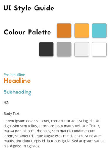
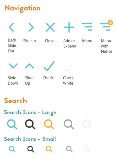
I created a UI style guide, which was a living document. It included modularized uses of typography, colours, and symbols. All enhancements to take the wireframe to become a visual prototype will need to use UI from the UI style guide, within reason. Most of the UI styles were determined collaboratively (use of fonts, button styles, etc.), while remaining details were filled with placeholder styles for the time being.
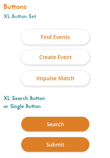
Equipped with a common UI style guide, we divided up the prototyping into key user tasks. Each of us were responsible for prototyping our assigned user task. Since we were building the prototype from a unified wireframe, this was fairly straight-forward.
At this point, I was the designer who was the most comfortable with prototyping software, so I became the ‘master’ prototyper. All designers would send me their files, in order for me to incorporate everyone’s work into one master file.
Overall, this design workflow worked well to manage the project and to ensure a singular contact for prototyping inconsistencies. Despite software limitations, we were able to collaborate on the UI design fairly well.
We created a list of user questions to ask our users, as a means to guide the user testing sessions. We completed six user interviews (about 30 to 45 mins per session), which used the following structure:
We introduced the app concept, and how the user test will be conducted.
We asked the tester to complete four user tasks, with minimal prompting by the designer.
We asked the tester a set of pre-determined questions, which was a mix of task-oriented and open-ended questions.
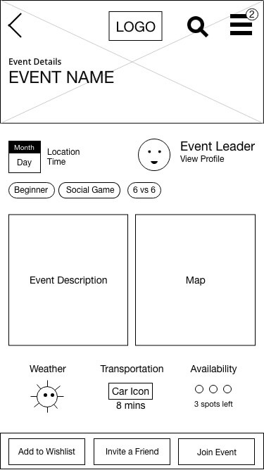
Based on user testing feedback, we further refined the UI design and user flows. In the end, we presented this final prototype to the class.
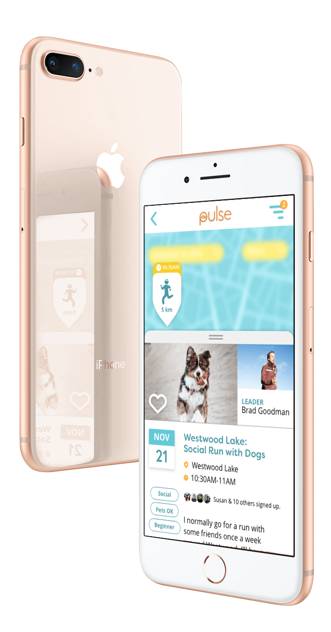
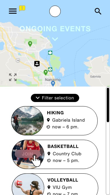
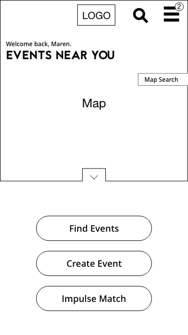
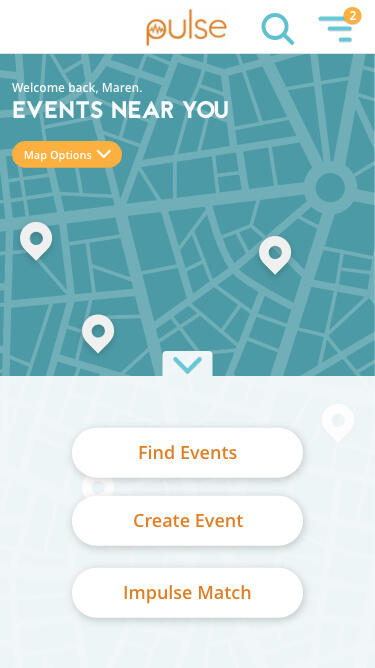
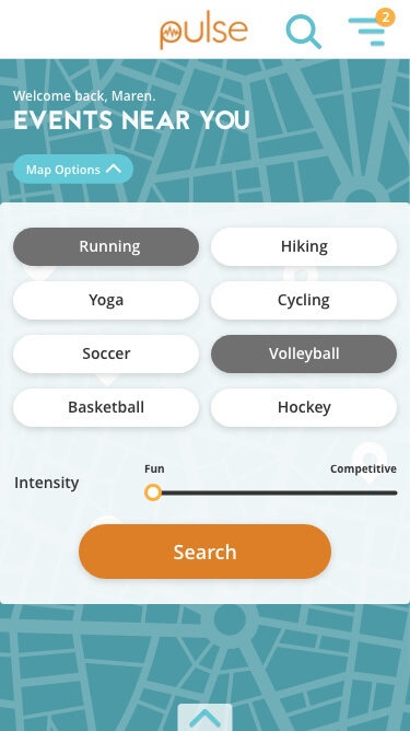
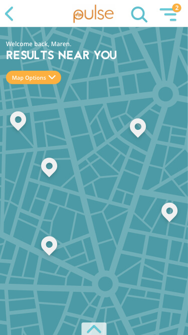
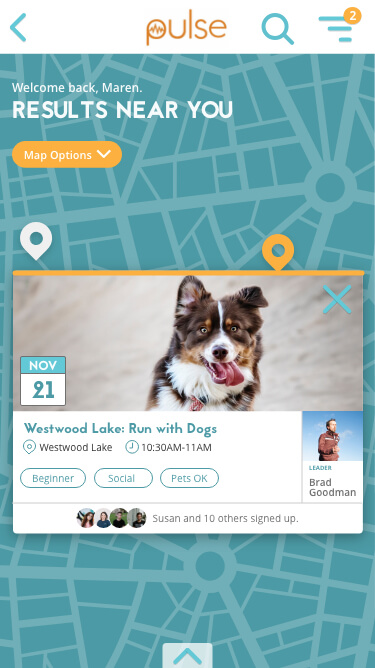
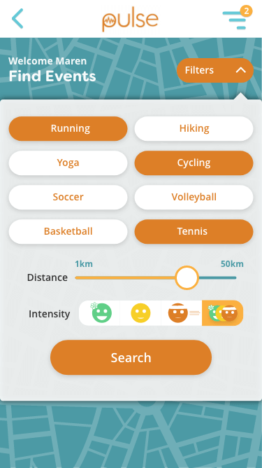
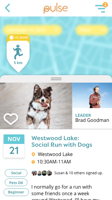
Instead of trying to give equal representation to map search and category search, we decided to emphasize map search as the main method of looking for activities near the user. This user flow encourages people to explore what’s happening in the surrounding area.

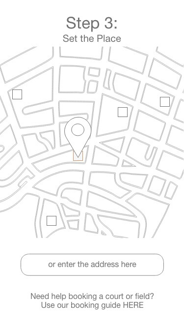
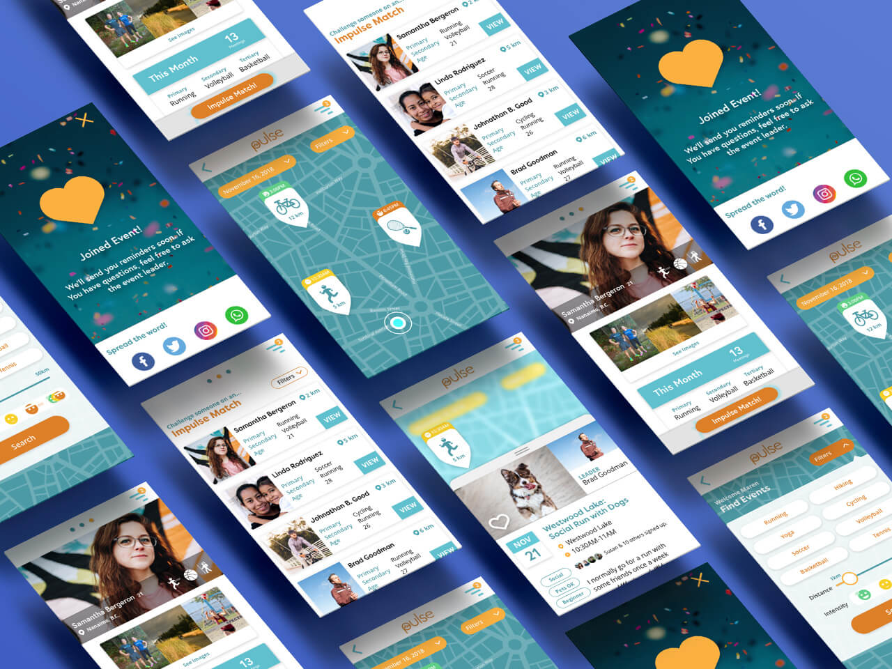
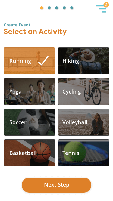
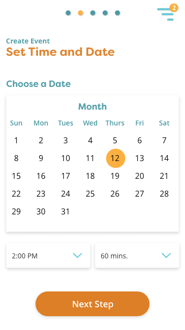
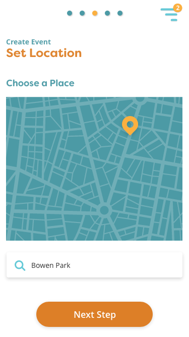
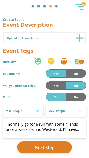
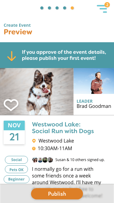
The create event user flow features step-by-step instructions on how to create and promote your first event. From setting a time, finding a location, to describing the event, we’ve kept the steps fairly straight-forward to make it easier for event leaders to organize events for their communities.
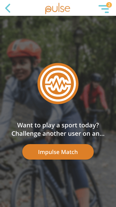
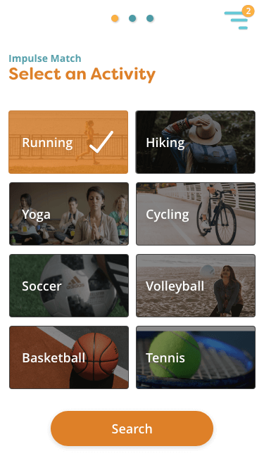
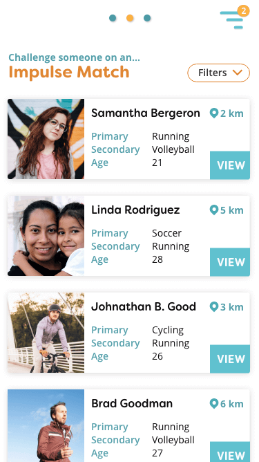
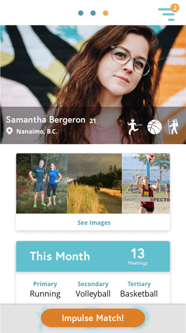
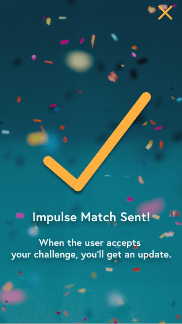
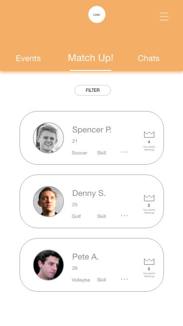
Like Tinder, but for spontaneous fitness partners
For spontaneous people, we wanted to introduce Impulse Match. This user flow helps people find activity partners on the same day. Have a few hours to kill before class? Go for a run with Linda or try yoga with Samantha. Impulse Match is only activated when people indicate that they want to participate and broadcast their availability, making sure that only like-minded spontaneous people may match with each other.